Saturday 29 June 2013

Newer, Shinier - JOHN LAWRENCE SULLIVAN SS14

Yanagawa Arashi's label, JOHN LAWRENCE SULLIVAN is an excellent dose of Japanese fashion with a European twist. The collection has so many interesting looks that are so fresh and structured that it captures the best of both world. All the looks are posted here.


I'm excited about all the jackets and blazers in the collection. They're so well put together and the designs are so wearable but at the same time, super interesting. Yes I do love blue and black together and big checks are big ticks for me.

I also like the move away from 'vintage' because I feel that so many labels are just resting on that. Yanagawa's step forward with the bold leather backpacks and the whole shiny plastic looks are great this season. Really liking the black mesh top with red underneath because black and red is also super cool. Great caps also. The shoes were less striking this season compared to its FW range but I'm still very happy about everything :D

Electric Blue


Thursday 27 June 2013

The Classically Elaborate Menswear - D&G SS14!

Are large graphics still in? D&G says yes. The boastful Italian luxury brand (one of my favourites since 2010) has returned to its roots (Sicily, not of a giant tree), digging up inspiration from the mythos. The iconic statutes and architecture create such a nostalgic feel to the pieces this season. No more strikingly bold colours like that of SS13 (which really reminded me of Italian food somehow) but going for something much more classically aesthetic, kind of playing it safe though.

G&D

I really enjoy the colours because D&G always does an excellent job with gold-ish tones. They also always have the best shoes. There were so many looks showcased at Milan Fashion Week in front of a giant tree and if you want to see them all, they're going to be posted on my Tumblr here. You gotta love the D&G fashion show where in the end, a swarm of fashion walks towards you in black suits.

For SS, D&G is also great at creating loose fitting tops, and as with every season, it's a reminder of the Mediterranean life-at-sea heritage. It's also good to see loose fitting tops because that sort of cutting is much more like how we imagine fabric was worn in those times. It's quite paradoxical and interesting to look like plebeians but to wear such elaborate and luxurious prints. Overall I enjoy the colours and cutting of the pieces the most.

My picks:
All that glitters probably is gold

Sunday 23 June 2013

Admixture of Art and Technology - Christopher Kane SS14

Charged with fascination for science and technology, Christopher Kane has developed his SS14 menswear range on the foundations of vector lines and computer graphics. Christopher Kane's striking prints and ideas this season is a refreshing twist away from the usual graphics. These illusions, created by very clean and neat lines on contrasting colours make the looks pop. Almost every piece there is a strong statement piece.


Christopher Kane worked with some of my favourite colour combinations, red and black, and blue and black. These looks are very bold with its geometry and colours but there are also pieces which are more tame. It's so interesting to have this technological concept whilst working with a simple palette for a more minimalist and neat approach. The shirts are also very creative (the buttons) and it's great to see some more experimentation in mens fashion but at the same time, maintaining a structure which is very important for ready-to-wear menswear. The range is so strikingly exciting, I'm really inspired.

Friday 21 June 2013

A Party That Was NO GOOD - SUCK IS FREE Launch Night!

My attendance to my first ever launch event and it was crazy as hell. What a way to end a traumatising week of uni exams! SUCK IS FREE held their launch last night at a basement +ESTATEofMIND and it went off! A mix of crazy designs, crazy designers, crazy bloggers, crazy dogs and just general craziness made the night amazing. It was an awesome night for me and I thank A Series Of Fortunate Events and SUCK IS FREE for having me there. Everyone looked awesome in their gear, because not only do #UKNOWIAMNOGOOD, everyone was just badass.

How good is this?!

+ESTATEofMIND

+ESTATEofMIND was excellently set up. The decor was so awesome and showed of a lot of their super interesting pieces as well as the highlights of the night, SUCK IS FREE. It was great to see everyone dressed up ready to kill it and showcase some of the most creative and out-there pieces SUCK IS FREE had to offer. The bold prints and in your face attitude is what +ESTATEofMIND and SUCK IS FREE is all about.

Tuesday 18 June 2013

LOOKBOOK | No Good

SUCK IS FREE is launching their label at +ESTATEofMIND this Thursday night, 20 June and I'm super excited to be a part of this launch. The AW13 collection U KNOW I AM NO GOOD is all about the underground, subculture and just everything crazy and no good, but the fashion? It's crazy good. Excited about the brand? Check this out. The label is super creative at reconstructing pieces and using hallucinogenic prints.


No Good is the look I'll be wearing to the event. The Panel Cap boasts the label's logo and the design is really good. It's a strong cross between words and pictures that makes it visually appealing and demands attention. The loudest piece is of course the Parka Jacket from its sample range. It's actually a restructured upside down jacket which gives the look much more texture. This idea is fresh and experimental, giving it an edge in creative design. Oh and googly eyes? Yes pls. Also really excited about the Print Tee, it feels so occult with those symbols.

SUCK IS FREE Panel Cap
SUCK IS FREE Parka Jacket (Sample)
SUCK IS FREE Print Tee
CHEAP MONDAY Black Skinny Jeans
deepstyle Faux-Leather Ankle Boots


Monday 17 June 2013

Topman remaking ready-to-wear menswear with SS14

Topman is setting a new direction for menswear in SS14. Topman Design has adopted a much more fashion forward approach, further cementing its position as one of the top stakeholders in popular fashion today.


Topman's show was very unexpected, changing up what it's label represented with a modern take on Western inspired themes and precise detailing to create a higher fashion feel. This collection moved away from their safe-zone and played into something more experimental for the label. As established as one of the top retailers for fashion needs in Britain and also emerging in international markets, Topman's diversification in fashion couldn't be more timely. This collection appeals more to the fashion forward and is a showcase of how creative and edgey Topman Design is.

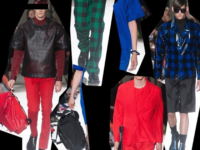
Most notably were of course the silk florals in cleverly structured shirts. These were magnificently stylish. Sewn prints are much more exciting as they create so much more interest in a piece, giving the look  texture and style. Don't forget about the bold colours, contrasting panels and solid edges which demanded attention for these looks. Further, the wide pants really took the fashion to another level. I also enjoyed the metallics in the looks. Mirror shades with detailed frames, and the shiny shoes were the sprinkles of future which elevated the show to more than just what you might think is ready-to-wear. The whole show was a whirlwind of mens fashion.

Also, claps for the production team. I love raised runways because it lifts the whole show (quite literally). The shape of the runway was also smart. It was also great to see the models walk around to showcase the look from different angles, once again, making the most out of the textures in the looks.

Thursday 13 June 2013

Zara - May Lookbook (Mens)

Zara is a fashion favourite for many people and that's because it is on point every season. It's style is so distinct but at the same time modest enough for everyday wear.


The most important part of this lookbook is turning up what is considered 'overdone' with florals and bright colours using innovative, clean cutting and fit. The items in the lookbook release are so strong and such a great export of Spanish ready-to-wear. The looks are modest yet eye catching, giving them such a distinct style. And that's how fashion should be. All the pieces are very creative and can be styled up with what you already have. The Zara Man is effortlessly stylish.


Images from http://www.zara.com/us/en/lookbook/man/may-c421501.html

Wednesday 12 June 2013

Your Stage Is The World.


Show the world the best of me. Someday put my name in lights.
STAGE HYALINE OF WORLD Leopard Accent Tee

Monday 10 June 2013

Instadigest | 2013 Autumn

Welcome winter. Actually, it's getting a bit too cold and rainy and annoying. Oh and June means exams D:


Friday 7 June 2013

Age of Intimacy Evening: Cotton Candy

The first of a series of performances and intimate evenings, 'Cotton Candy' by Australian cult lingerie label Age of Intimacy in collaboration with A Series of Fortunate Events was to raise awareness for beyondblue, an organisation targeting depression and anxiety. This intimate evening boasted theatrics and dancing, on top of a fashion show. Greeted at the door by fire-spinning and fire-eating performances, I made my way up to Studio501 where contortionists and acrobatic performances were already making a scene.

Wednesday 5 June 2013

LOOKBOOK | Burning Blue

Haven't been on lookbook for a while. Anyway, back to studying for finals after this.

Burning Blue is a feeling, it's a carefree but strong feeling. It's about a blue flame burning in your heart. It's about feeling the strength of blue; when your soul is burning blue. Because even if my body perishes, my soul is still burning blue. Cecil is on my heart.


Keep on shouting, keep on fighting, burnin ' blue.

Tuesday 4 June 2013

Suck Is Free aw2013 - U KNOW I AM NO GOOD

Thanks to A Series Of Fortunate Events, I'm crazily excited to be involved in the launch event of S I F in Australia this month, a Hong Kong born fashion label. Suck Is Free is releasing their AW collection.


This label is everything fun and pop culture, everything current and retro, everything crazy and a little bad. The unique prints are appropriated from hallucinogenic visions which reveal a lot of character and attitude. The in-your-face boldness of the look ties in well with it's likeable obnoxiousness.


Also, just from their sample range, there is a lot of texture at work, reminding me of Japanese street fashion tied in with HK freshness in the look. It feels a lot like mix and match to create a super unique look to reflect anyone's loud personality. If we number them left to right, I think I'm quite crazy about the 7th look. The treble clefs are such interesting additions to the whole look.


Looks like it's going to be a crazy launch night.

Sunday 2 June 2013

gitch fw2013 - Back To The Egg

New Japanese label 'gitch' is designed by singer MAA. MAA is one of my favourite artists since I've discovered her music in 2011. She is known for her eccentric style in writing her music as well as the delivery of it. It's great to get to know her and her personality through twitter and instagram on top of the music she writes. This is just another way which she showcases her personality as a 'Crazy Monkey'.


Unfortunately the site at http://www.gitch.jp/ isn't up yet but MAA has revealed some images for this collection. Take a look, the collection is brilliantly lively and saturated with personality. This is their second collection after 'LaLaLa Gypsy' for ss2013.

You can follow @gitch_collection on instagram :)